The digital workplace should bring clarity to day to day operations with straightforward and engaging information management. Confusing templates and lackluster web parts can drive down intranet adoption and lead to an overall uninspired intranet design. At Powell Software, we strive to put the user experience at the forefront of all our digital workplace solutions. Following in Microsoft footsteps, Powell Software has expanded our set of intranet design templates with a new Modern SharePoint template. We are proud to release this contemporary theming that is visually engaging and less cluttered to enhance the user experience.
Discover the Orion Intranet Design Template
Named after Orion, one of the most conspicuous and recognizable constellations in the night sky, the new Powell 365 experience is a fresh take modern SharePoint standards. This look and feel optimizes the modern experience. The whole interface design is based on making the user experience lighter with more agile and attractive features. Our users will especially enjoy this release, as the new display is extremely sleek and easy to implement.
“This is a new site layer that will be able to improve the employee experience in terms of design and functionality. It’s an evolution of Powell 365,” said Clement DeQueral, Account Manager at Powell Software.
A minimalist UI
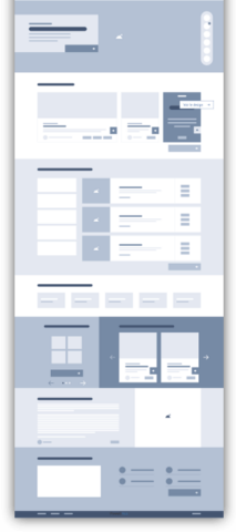
Appearance and readability are critical in the design of a user interface. We paid special attention to every detail so that the Orion intranet theming is effective in bringing a readable and engaging experience for employees. Sitting on top of SharePoint modern, the new theme option includes a cool color scheme that is not abrasive on the eyes. Clean lines in this responsive grid template clearly showcase information, media, and documents. The simplified control elements are refreshing for end-users. Plus, the Orion design template adapts to any device and compatible with the last generation of browsers (Edge, Safari, Firefox, and Chrome).
“The performance of this tool will play on the adoption of the intranet portal. This is a project that is part of continuous improvement, “said Karim Guenaneche, Powell 365 client, at AFM Telethon.
Updated Navigation components
The intranet design template has updated navigation, bringing different options together, and ensuring an immediately clear path through the SharePoint sites. This theming now includes both the standard header layout and the compact header option, which moves all content in the header onto one single line. The headers can be configured to include eight different pages with their corresponding subsites.
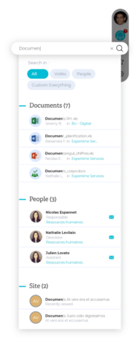
Leveraging the UX, actions commonly found via the header have been transformed into a simplified floating menu aligned on the right side of a page. This floating menu is set up to display, a user profile, notifications, a search capability, connected to the enterprise search web part, user/company favorites, direct translation leveraged from Azure Cognitive Services, and the Powell Gear which enables users to create content in different languages.

With mobile-first usage in mind, a collapsible footer option is included to improve navigation regardless of what screen they use. The footer content is displayed on each site globally. The new component footer retracts in size while a user scrolls through SharePoint sites and can expand when the footer content, various links, documents, or information, is needed.
Web part Displays
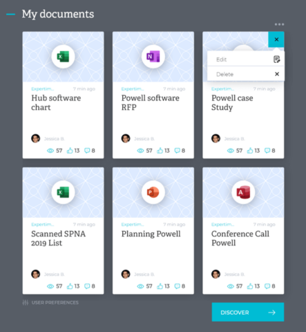
This Orion design view is also available for all Powell 365 web parts. The display reflects a fresh content organization and cool graphic display. It includes new element controls like rollover setting options and drop-down menus. There are also different web part structure options, where user preferences and see “see more” action buttons are at the bottom of the display. Plus, there is no overlap with native SharePoint features. All of your favorite web parts like the Modern Slider web part, the Quick Links web part, the Welcome To, and the Discussion web part can be smoothly implemented with the Orion design and require zero coding.

Atomic Design
The Orion intranet design follows what is known as the Atomic Design methodology. This is a front end development design approach which breaks down a site layout into basic components and then builds out site creation by layering these components into an effective interface. These design rules, created by Brad Frost, are inspired by chemistry and allow for streamlined customization. This creates a unified design experience and allows our customers to reuse design aspects in Powell Manager.

Update your Intranet with the Orion design today!
If you are already an existing customer of Powell Software and are interested in updating your Powell 365 layout, the Orion design template is an awesome option. The design template and theming is available in Powell Manager. We have our team of Customer Success Management, Support, and Sales agents and network of partners at your disposal for any questions. Get in touch with us today!


