A bit of background
Messe München is one of the world’s leading trade fair organizers, operating in a dynamic and highly visible environment. With 624 employees in Germany, internal communication and operational clarity are essential to ensure smooth coordination across teams and events. To modernize its digital workplace, Messe München transitioned from a legacy SharePoint environment to SharePoint Online Modern, enhanced by Powell as an add-on. The objective was clear: build a visually distinctive, intuitive intranet that supports daily work while reflecting the organization’s evolving brand identity.
Their challenges
The relaunch took place during a broader corporate rebranding initiative. Key elements of the new corporate design, including the final color palette, were still evolving while the intranet project was already underway. This required the team to design within uncertainty and continuously adapt visual decisions as new brand guidelines emerged. To stay aligned with the project timeline, the team began building the visual concept around two core blue tones that were already confirmed. The challenge was to create a dynamic and engaging experience with a deliberately reduced color spectrum.
Another objective was to clearly distinguish the new intranet from the former environment. Users needed to immediately recognize that this was not a minor update but a completely new platform. Additional complexity arose from integrating multiple versions of similar content categories, including two different types of news and events. Both needed prominent placement at the top of the landing page while remaining visually distinct and logically structured.
Their solution
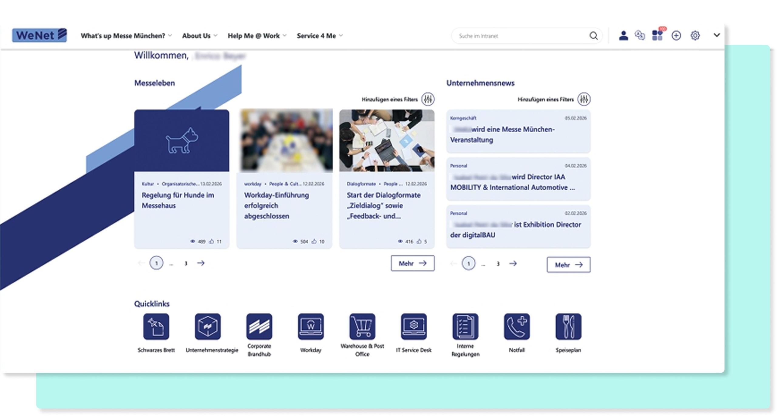
The new intranet was designed as a clean, organized environment that supports daily work without visual overload. While the interface feels minimalistic on the surface, it is built on carefully considered structural and visual decisions. Through iterative prototyping, multiple landing page versions were tested directly within the system.
Systematic use of distinct templates and header images for each area.
Aligned pagination, enlarged fonts, and translation function integrated into the header.
Reduced clutter and intuitive navigation to support everyday use.
Key design principles included:
- A consistent visual language derived from the evolving corporate design
- Bold, eye-catching landing page elements to signal a fresh start
- Clear hierarchies and intuitive navigation
- Reduced text in favor of structured visual orientation
- Distinct header images for each main navigation area
- Systematic use of page templates to ensure consistency
Numerous refinements enhanced both aesthetics and usability. Pagination and “see more” buttons were visually aligned for clarity. Headline colors were adapted to the primary brand tone. The translation function was moved into the header for faster access. Redundant site headers were removed to reduce clutter. Accessibility improvements included increased font sizes in the main navigation.
KPIs
📊 The key figures
Increase in views between the first month and January
Total number of page views reached (compared to 55,000 previously)
Page views generated in the first month by ~700 users
The intranet launched on 9 December 2025 as a full rebuild on a new technology stack. It needed to gain user trust quickly. These accelerating engagement figures confirm that the design and usability approach resonated with users, representing a 36.9 percent rise in overall activity.
Results
The relaunch transformed the intranet into a daily companion for employees. With clear information architecture and intuitive navigation, key content became discoverable in seconds. Visual consistency and structured layouts reduced cognitive load and improved orientation.
“Now, I can find everything in just a few clicks and feel much better informed. The intranet has become a daily companion that noticeably makes my work easier.”
— Collaborateur, Messe München
“From an editorial perspective, the relaunch gives us a wide range of display options, which is also reflected in the intranet’s usage rates.”
— Équipe Éditoriale, Messe München
✨ Lessons Learned
- Design as Strategy – Strong visual identity drives user trust and platform adoption.
- Iterative Prototyping – Testing layouts in context allows for faster and more sustainable decisions.
- Clarity Over Clutter – Removing redundant headers and simplifying spectrum improves cognitive focus.
Conclusion
The Messe München intranet relaunch demonstrates that strong design is not decoration. It is strategy. By aligning visual language, information architecture, and user experience within SharePoint Online Modern and Powell, the team created a digital workplace that is intuitive, brand-consistent, and future-ready. The project highlights the power of iterative prototyping, close collaboration, and a clear focus on usability. The result is a cohesive intranet experience that balances bold visual identity with everyday practicality.
About the Partner: HIRSCHTEC
Specializing in the digitization of internal communication and collaboration since 2005, HIRSCHTEC customers get everything from a single source: from developing the big picture for the digital workplace to the introduction and further development of intranets, employee apps and digital workplaces based on M365, from the automation of workflows to support in digital leadership.
Ready to master your brand relaunch?

Trinity Resting
Product Marketing Manager
Product marketing doesn’t have to be all jargon and slides—Trinity’s here to prove it’s about creating human connections. With 5 years in digital marketing, she’s been scaling, building, and transforming product strategies that resonate with real people. At Powell, Trinity ensures the message isn’t just heard, but felt. She’s passionate about helping teams go beyond the office and build lasting relationships. When she’s not crafting strategies, you’ll find her sipping tea (she’s a self-proclaimed tea-aholic) or working as a professional dog sitter—because, let’s be honest, dogs are the ultimate team players.