Background about the customer
Stern-Wywiol Gruppe is a growing corporate group in the consumer goods sector with around 2,000 employees across multiple brands and locations in Germany. As the organization expanded, so did the volume of information, tools, and content.
The challenge was no longer about providing information. It was about providing orientation.
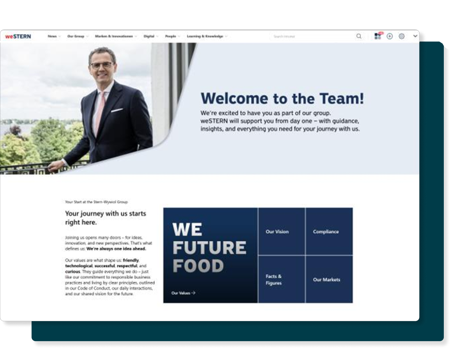
The result is weSTERN, the group’s central digital workplace that connects knowledge, tools, and communication in one structured, intuitive environment.
Their challenges
As the group grew, the intranet evolved incrementally. New content areas were added, new requirements emerged, and structures expanded. Over time, it became clear that small adjustments were no longer sufficient.
One of the biggest challenges was scalability. The intranet needed to grow with the organization without losing clarity, usability, or identity.
The navigation relaunch became a central turning point. The goal was to create a structure that was:
Design played a strategic role. Instead of using visual elements as decoration, the team used them as orientation tools. A reduced and consistent color palette based on corporate colors helped create clarity rather than distraction.
Another important example was the redesigned onboarding page. It was designed to feel like arriving. Clean layouts, guiding icons, consistent colors, and a welcoming image with a CEO quote create orientation for new and existing colleagues alike.
Their solution
The design principle of weSTERN was simple: usability comes first. Every decision, from navigation labels to layout structure, was made to support orientation and everyday work.
The relaunch of the navigation, supported by Powell Manager, created a scalable and structured information architecture. Strong, meaningful labels and a clear internal mindset shaped the wording and organization of content. Values such as pride, growth orientation, and a strong sense of “we” were deliberately embedded into navigation and structure.
✨ Key Structural Elements
- Branding – Reduced, consistent color system derived from corporate identity.
- Consistency – Systematic use of page templates and recurring visual patterns.
- Navigation – Integrated machine translation, favorite apps, and personalized links.
- Functionality – Selective use of Powell web parts for maximum functional value.
A practical example of this approach is the redesigned commercial register page. Previously, documents were distributed manually via shared drives. Today, all extracts are centrally accessible, clearly structured, and easy to download. A formerly complex administrative task is now streamlined and reliable.
The intranet no longer feels like a collection of pages. It feels like a coherent system.
KPIs
The new navigation rolled out in January 2025, followed by the implementation of the new design and new pages throughout the year. The impact is measurable.
📊 The key figures (Growth 2024 vs 2025)
Increase in unique page views (48,408/mo)
Increase in content downloads (940/mo)
Increase in monthly visits (28,480/mo)
Increase in active users (1,119 users)
The strong growth in page views and downloads demonstrates that employees not only visit the intranet more often but also actively use its content.
Results
weSTERN has become a reliable daily companion. Instead of searching across drives, platforms, and contacts, employees find information in one central, structured location. The platform reduces uncertainty and supports independent work.
“You can feel that our intranet was built with users in mind. It doesn’t try to do everything at once, but focuses on what really matters and that’s why people actually use it. Good intranet design means reducing complexity.”
— Annika Bode, Internal Communications Manager
“weSTERN is about providing information from one source, in one voice, and in a way that truly supports everyday work.”
— Ilka Hübner, Head of Corporate Communications
Beyond metrics, the biggest impact lies in trust. Employees know where to find up-to-date information and feel confident navigating the platform.
Conclusion
weSTERN demonstrates that great intranet design is not about visual effects. It is about clarity, structure, and scalability. By combining user validation, consistent design language, and Powell’s scalable architecture, Stern-Wywiol Gruppe created a digital workplace that grows with the organization while remaining intuitive.
The project shows that when design serves orientation and structure serves people, engagement follows.
About the Partner: HIRSCHTEC
Specializing in the digitization of internal communication and collaboration since 2005, HIRSCHTEC customers get everything from a single source: from developing the big picture for the digital workplace to the introduction and further development of intranets, employee apps and digital workplaces based on M365, from the automation of workflows to support in digital leadership.
Ready to transform your communication?

Trinity Resting
Product Marketing Manager
Product marketing doesn’t have to be all jargon and slides—Trinity’s here to prove it’s about creating human connections. With 5 years in digital marketing, she’s been scaling, building, and transforming product strategies that resonate with real people. At Powell, Trinity ensures the message isn’t just heard, but felt. She’s passionate about helping teams go beyond the office and build lasting relationships. When she’s not crafting strategies, you’ll find her sipping tea (she’s a self-proclaimed tea-aholic) or working as a professional dog sitter—because, let’s be honest, dogs are the ultimate team players.